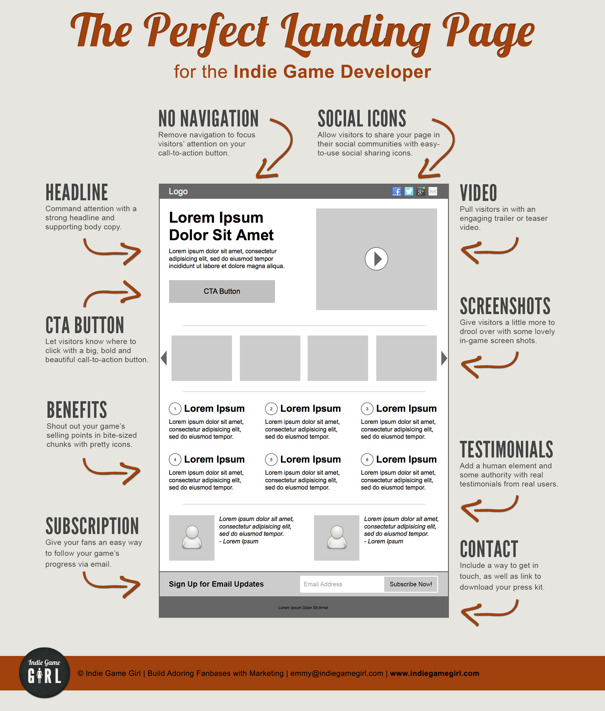
What’s a Landing Page?
A landing page is like a website, but super focused on one thing. Let’s say you click a Facebook Ad for a watermelon flavored chapstick. The click takes you to chapstick.com’s homepage, and now you have to search and find the watermelon flavor you want. That’s not a great experience, right?
Instead, you want someone to click that same ad and go to a landing page that is just about the watermelon chapstick and nothing else! The sole focus is that flavor.
Some landing pages will be focused on getting sign ups for a product launch, getting people to purchase, getting people to sign up for an ebook, etc.
Landing pages have information about the one thing you’re looking to put in front of visitors. It focuses their attention.
Why not send them to a page on your website?
Sure, you can do that. But we all know how easily distracted people get. If you send them to your website, they may end up clicking the navigation bar or the sidebar to go somewhere else.
A landing page is sparse. It usually has information, a graphic, and a form to fill out or a buy button. You remove much of the distracting features of a website like the navigation bar, cluttered sidebar, and footer. You can have some links on the landing page, but you want to stay focused on your goal.
Can you give an example?
Yes! Let’s say you’re doing a giveaway to grow your email list. You’re running Facebook Ads to do a giveaway of 1 month of your service for free. Your landing page should include information about the giveaway and your company and a form for people to sign up.
Can we see some landing pages?
Absolutely! This article from Hubspot has some great examples of well designed landing pages.
How do I get started?
If you have a web designer on staff, you’re in luck because they’ll be able to create landing pages for you. Otherwise you may need software like Leadpages or Unbounce to build and launch your landing pages. These sites are easy to use, drag and drop, so you can get a simple page up in less than 30 minutes.


